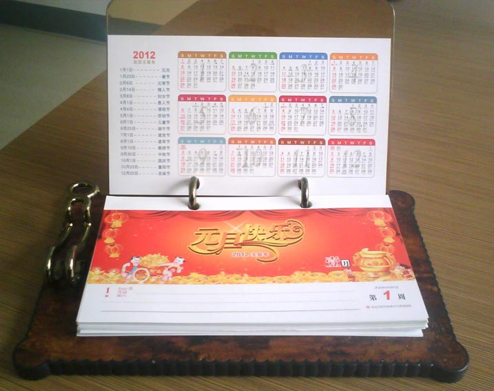


济南台历挂历设计需要注意事项有哪些?
台历挂历这是我们生活中再常见不过的东西了,它是用来为我们显示时间的,我们生活的正常运行也离不开它。虽然对于台历挂历我们都十分的熟悉,但是如果说到台历挂历在设计时需要注意的事项,恐怕知道的人就了。那么,台历挂历设计需注意事项有哪些?下面来一起来看看吧。
This is the most common thing in our life. It is used to show the time for us. The normal operation of our life is inseparable from it. Although we are very familiar with the calendar, if we talk about the matters needing attention in the design of the calendar, I'm afraid very few people know it. So, what should be paid attention to in the design of the calendar? Let's have a look.
一、渐变的问题
1、 The problem of gradual change
1、常见的问题是这样:如红色→黑色的渐变,设置错误:(M100→K100)中间会很难看。正确的设置应该是这样:(M100→M100K100)仔细分析下就明白了,其他情况类推。
1. The common problem is as follows: for example, if the gradient is red to black, the setting is wrong: (M100 → k100), and it will be hard to see in the middle. The correct setting should be as follows: (M100 → m100k100) after careful analysis, it will be clear that other situations are similar.
2、透明渐变是适用于网络图形的办法,灰度图也可,但完稿输出不能用,因为空间混合模式为RGB,屏幕混合色彩同印刷CMYK差异太大。 3、黑色部分的渐变不要太低,如5%黑色,由于输出时有黑色叠印选项,低于10%的黑色通常使用的是替代而不是叠印,导致出问题,同样,使用纯浅色黑也要小心。
2. Transparent gradient is suitable for network graphics, grayscale image is also OK, but finished output cannot be used, because the spatial blending mode is RGB, the screen mixed color is too different from the printing CMYK. 3. The gradient of the black part should not be too low, such as 5% black. Due to the black overprint option when output, the black below 10% is usually replaced instead of overprint, which leads to problems. Similarly, be careful when using pure light black.
二、字体方面的问题
2、 Font problems
1、某些字体库描述方法不同,笔画交叠部分输出后会出透叠。
1. Some font library description methods are different, stroke overlap part of the output will be out of permutation.
2、包含中英文特殊字符的段落文本容易出问题。
2. Paragraph text containing special Chinese and English characters is prone to problems.
3、使用新标准的GBK字库来生僻字丢失的问题。
3. The GBK font library of the new standard is used to solve the problem of missing out of character.
4、台历挂历设计太细的字体,不要使用多于3色的混叠,如(C10M30Y80)等,同理,也不适用于深色底反白色字。避免不了的状况下,需要给反白字勾边,适用底色近似色或者某一印刷单色(通常是黑K)。 5、文字一定要转曲线;
4. If the font design of the calendar is too thin, it is better not to use more than 3 colors, such as (c10m30y80), and so on. Similarly, it is not suitable for dark background anti white characters. In case of unavoidable situation, it is necessary to tick the reverse white characters, and apply the background color to approximate color or a certain printing monochrome (usually black K). 5. Words must be curved;
三、图片问题
3、 Picture problems
1、关于psd文件,有一点需要注意:就是你导入它后不要再做任何“破坏性*动作”,比如:旋转,镜像,倾斜等,由于它的透明蒙版的关系,输出后产生破碎图。
1. One thing to note about PSD files is that you should not do any "destructive * actions" after importing them, such as: rotation, mirror image, tilt, etc. because of its transparent mask, the output will produce a broken image.
2、还是蒙版,在coreldraw中使用也要小心些,必要时候还不如采取“置入容器”方法比较保险。
2. It's better to use the mask in CorelDRAW. If necessary, it's better to take the "put in container" method.
3、分辨率和重新取样 不要在coreldraw中做这个,“转换为位图”的确方便,但损失的是色彩还原,要点,在ps中做好拿来。分辨率大于或等于300像素/英寸,尺寸与制作的台历尺寸相近;
3. Resolution and resampling should not be done in CorelDRAW. It is really convenient to "convert to bitmap", but the loss is color restoration. It needs to be professional and take it in PS. The resolution is greater than or equal to 300 pixels / inch, and the size is similar to that of the calendar;
4、色彩模式,所有图片必须是cmyk或者灰度和单色bitmap图,否则不能输出。(单色bitmap玩的人很少,但是玩得好就是一种境界了。)
4. Color mode, all images must be CMYK or grayscale and monochrome bitmap images, otherwise they cannot be output. (few people play monochrome bitmap, but playing well is a realm. )
5、文件格式是PDF格式,也可以是CDR格式或AI、EPS等矢量格式;文件一定要留有3mm的出血裁边。
5. The best file format is PDF, CDR, AI, EPS and other vector formats; the file must have 3mm bleeding edge.
对于台历挂历设计需注意事项,我们大致可以概括为这几点。点,渐变的问题;第二点,字体方面的问题;第三点,图片问题。所以在对台历挂历进行设计时,大家一定要将这几方面考虑在内,这样才能做出一本好的台历挂历。
As for the matters needing attention in the design of the calendar, we can roughly summarize these points. The first point is the problem of gradual change; the second is the problem of font; the third is the problem of pictures. So in the design of the calendar, we must take these aspects into account, so as to make a good calendar.
济南印刷厂讲解的内容 更多的内容 请咨询公司官网http://www.xinfengyinshua.cn/相关新闻
- 手提袋印刷注意事项及纸张材质 2023-06-09
- 如何选择高品质的印刷厂家 2023-06-07
- 包装印刷基础知识,你知道吗? 2023-06-05
- 三种不同种类的记事本印刷适用范围 2023-06-02